Designing a family tree app for every generation
I designed the UI for Treely, a cross-platform family tree app, with one goal in mind: it should work for anyone, including older users who are not comfortable with complex apps.
Family trees are often something older family members care about most, but most family tree apps are built with a young, tech-comfortable user in mind. I wanted Treely to be approachable enough that a grandparent could use it as easily as a grandchild.
Along the way, I also designed with a specific audience in mind: Indonesia's large Muslim population, where lineage and heredity carry real cultural and religious weight. That shaped several of the design decisions below.
As a personal project, this case study uses real screenshots from the shipped app.
I designed the UI in Figma and built the app together with friends as a personal project.
My responsibilities included:
- Designing the onboarding, tree view, node interactions, and profile screens
- Structuring the family tree as a connected node layout
- Designing the contextual add and edit flows for each family member
- Building the app with React Native
- Implementing a custom canvas rendering layer for the tree using React Native Skia
A family tree is not a one-time form. It is something a family adds to and revisits over years, often started by whoever is most invested, not necessarily the most tech-savvy person in the family.
That meant the app needed to solve for two different needs at once:
- Simple enough that an older, less technical user is not intimidated
- Structured enough to hold a large, branching tree without becoming visually confusing
The visual language was inspired by Samsung's One UI, which I find effective for clarity and touch ergonomics. Soft pastel colors, rounded cards, and plain, casual wording replace the dense, form-heavy look of most genealogy tools.
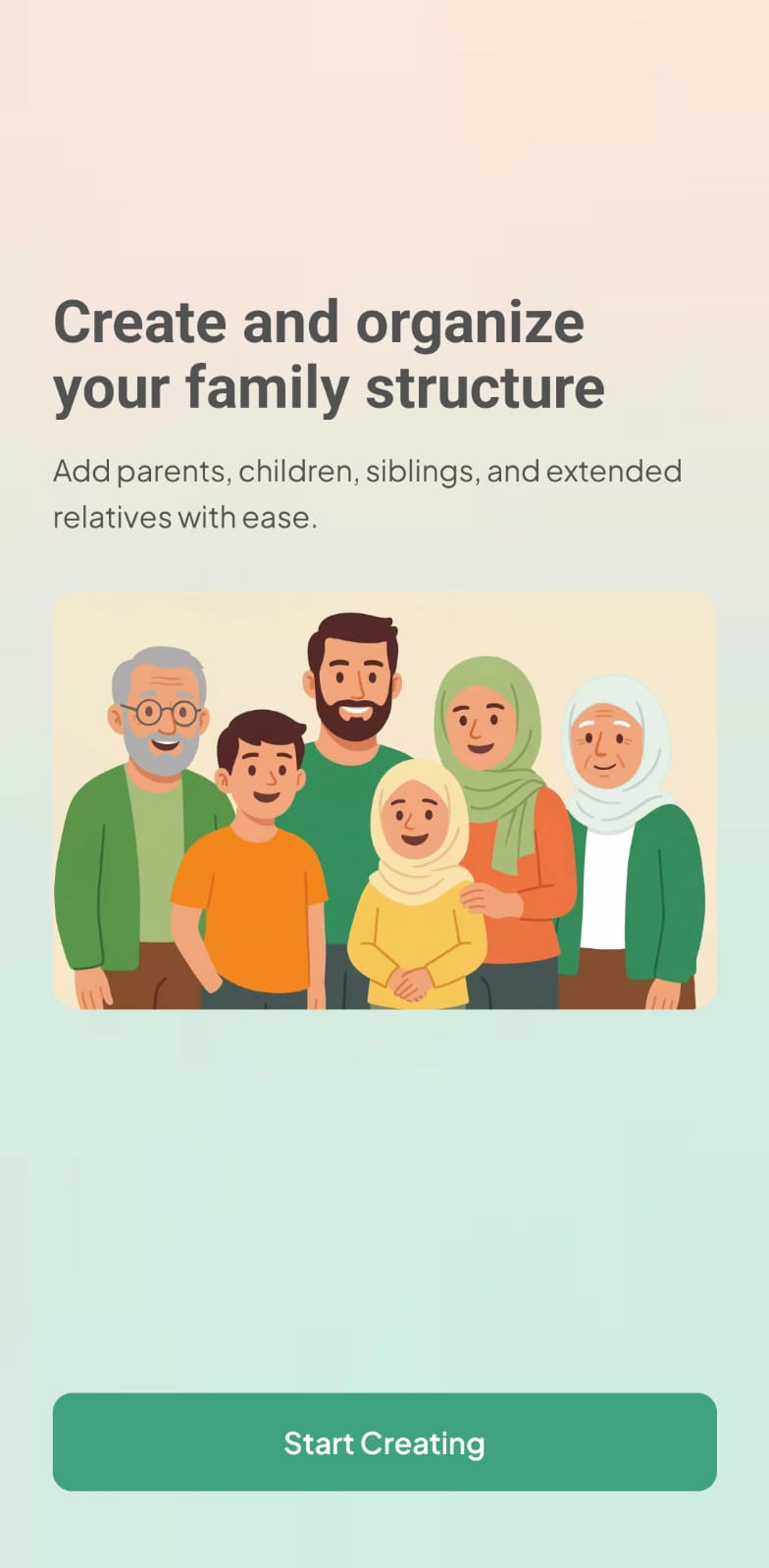
Onboarding uses a single illustration and one clear action, "Start Creating," rather than a multi-step feature tour.
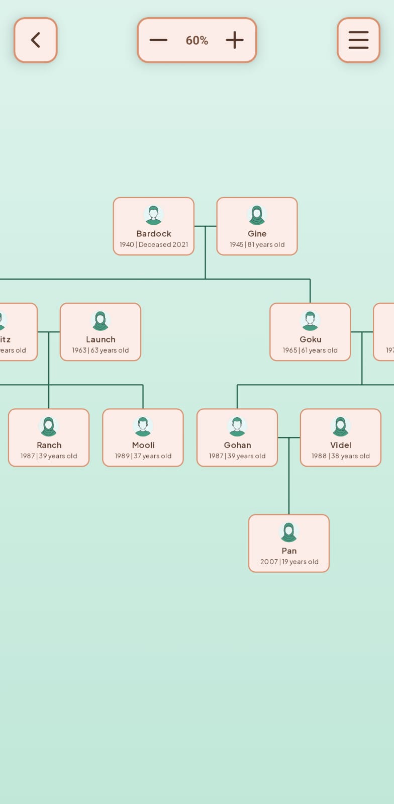
The tree itself is shown as connected node cards, with zoom controls so users can navigate a large tree without losing their place.
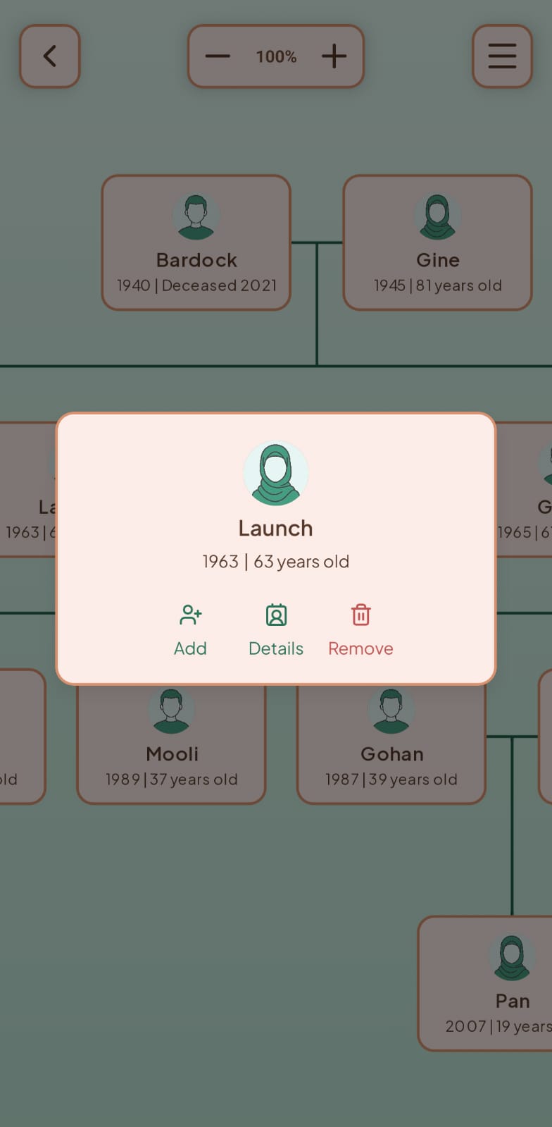
Rather than a single global menu for every action, I split interactions by scope.
Tapping a person's node opens a contextual card centered near that node, showing Add, Details, and Remove. Keeping the menu near the node keeps the action visually tied to the person the user is currently focused on, instead of a menu detached from context.
Tapping "Add" expands the same card into four relationship options: Child, Spouse, Sibling, and Parent. The whole add-relationship flow stays in one place instead of navigating to a separate screen.
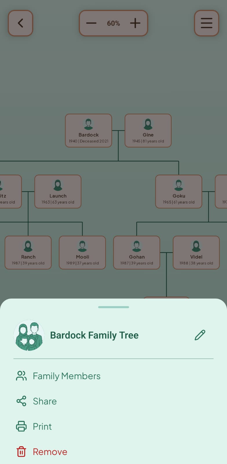
Actions that apply to the whole tree, not one person, live in a separate bottom sheet reached from the tree view's menu icon: Family Members, Share, Print, and Remove. Splitting per-person actions from tree-level actions keeps either menu from being overloaded with unrelated options.
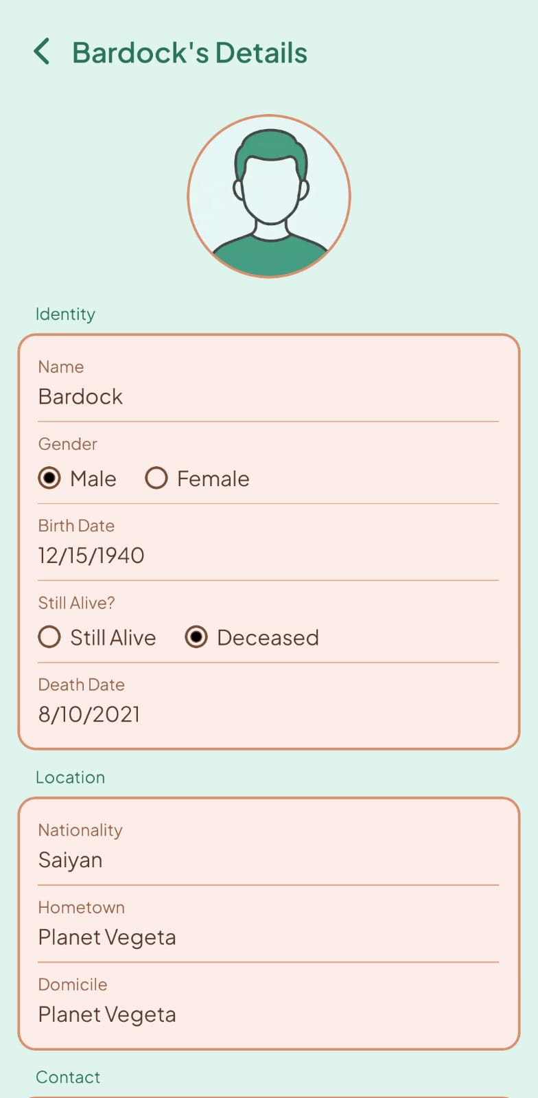
A person's full details, identity, location, and contact information, needed more room than a popup could give, so that screen is a full page with information grouped into labeled cards rather than one long form.
One decision came directly from designing for Indonesia's Muslim-majority audience: female nodes use a hijab icon on the avatar, rather than relying on color-coding alone to show gender. This is implemented and shipped, not just planned.
I also explored features specific to this audience, such as an inheritance calculator and a mahram (blood relation) display, since lineage carries religious as well as personal weight for many Indonesian families. These are unbuilt, but represent the direction I see for the product's next phase.
The project resulted in a shipped UI that combines an accessible visual language with a structure built around real family-tree use.
The app provides:
- A tree view that stays navigable as it grows
- Context-aware menus scoped to the person or the tree, not one catch-all menu
- A detail screen structured for a dense but readable set of information
- Design choices grounded in a specific target audience, not a generic user
The design was based on my own judgment rather than user testing. I would want to validate the age-accessibility goal and the Muslim-specific features with real users before taking them further.
Designing for a wide age range forced me to question defaults I would normally not think twice about, like where a menu sits relative to what the user just tapped.
I also learned that designing for a specific cultural context is not just adding a feature. It changes decisions throughout the interface, from something as small as an avatar icon to something as large as what the product should do next.